

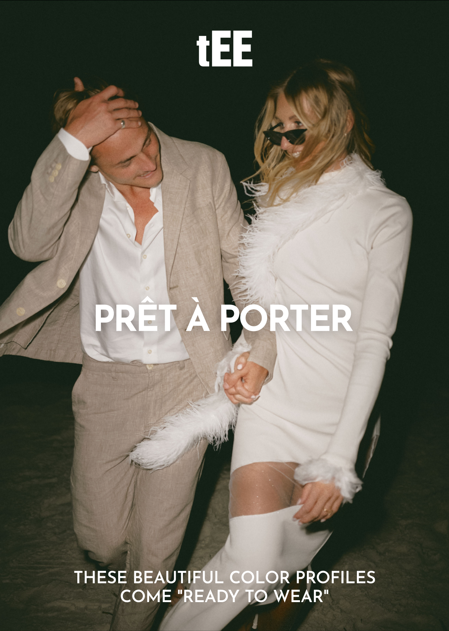
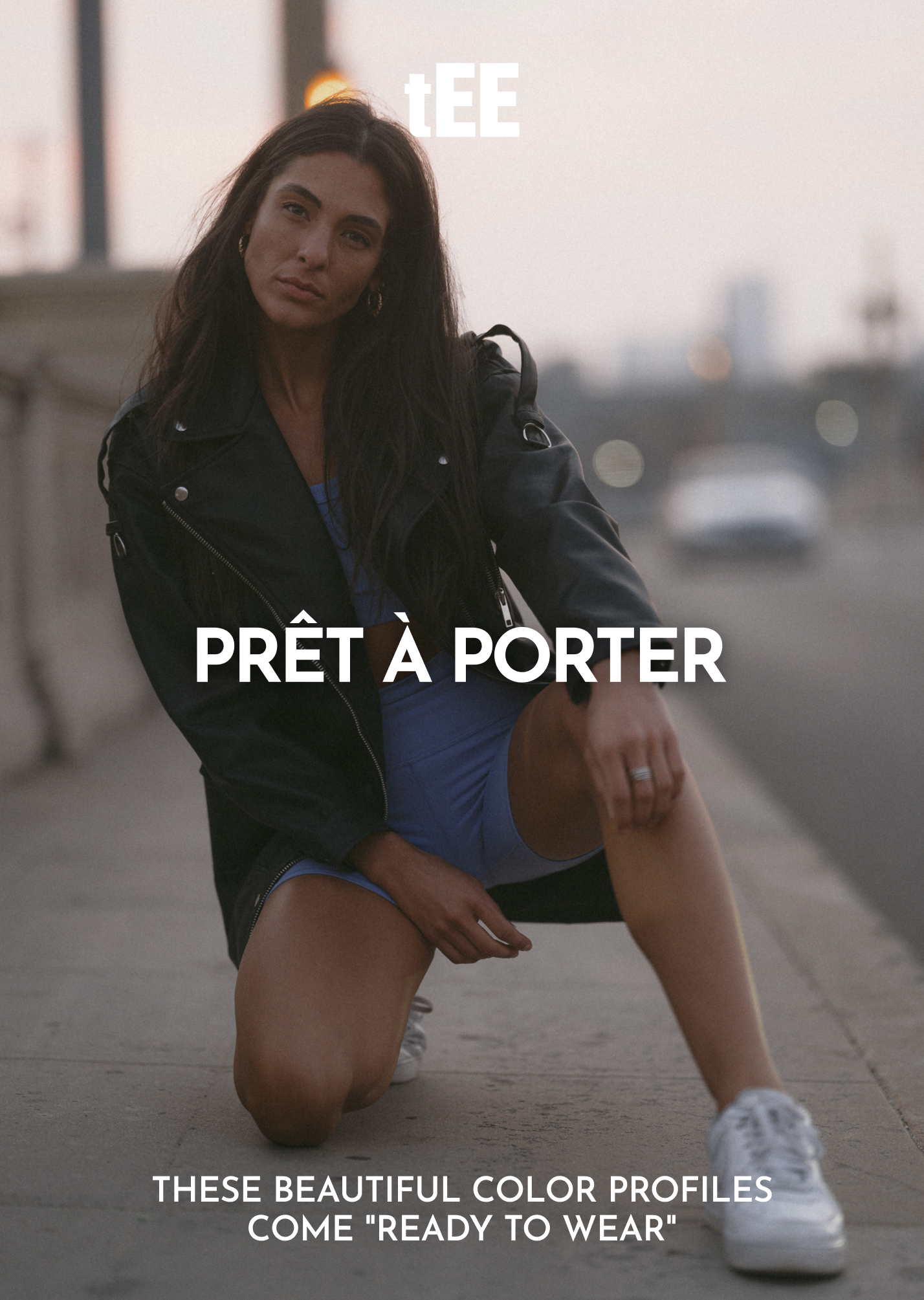


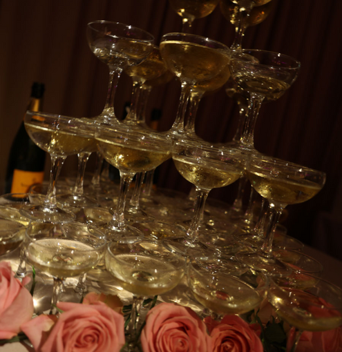
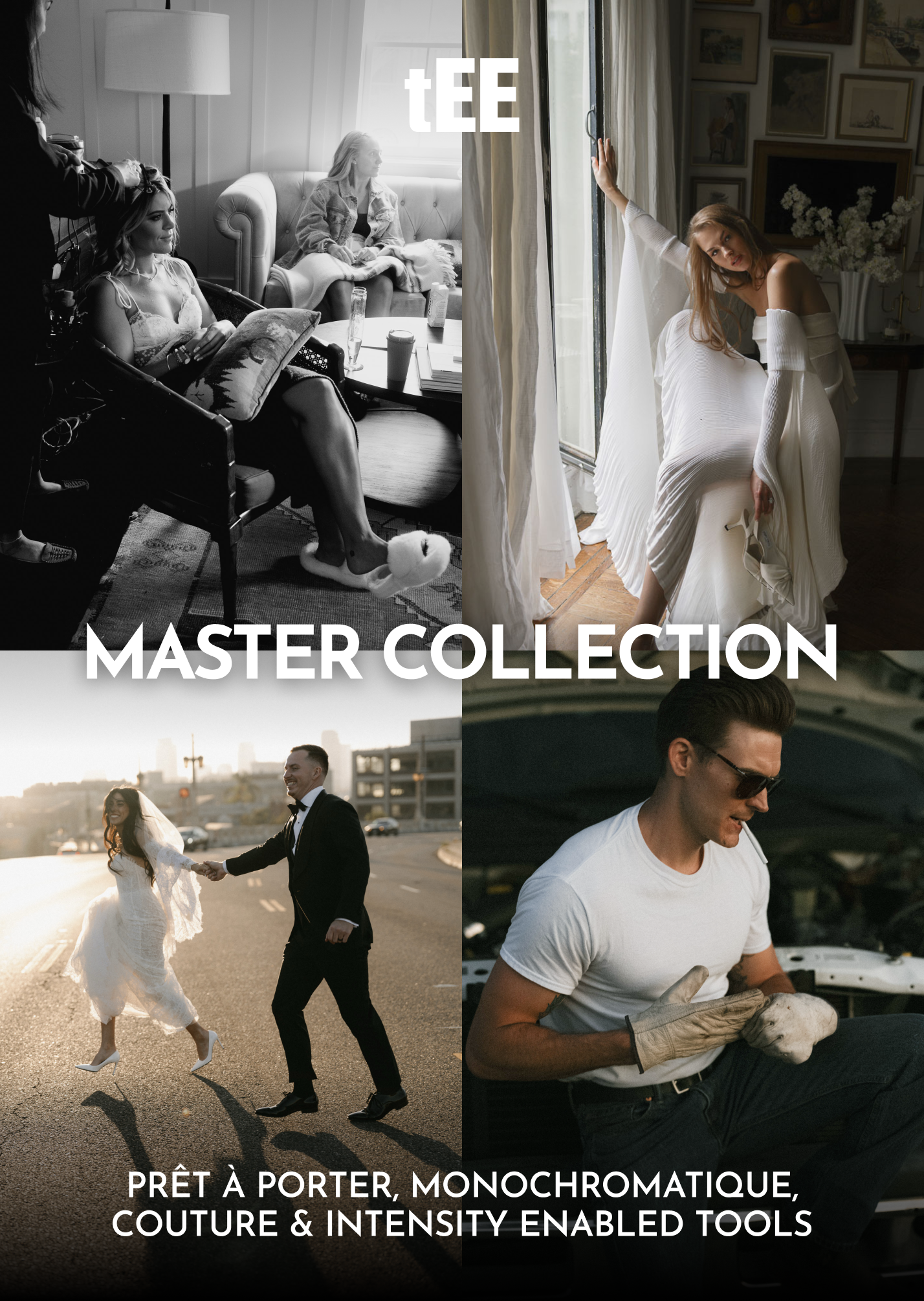
Prêt-à-porter Profiles + Intensity Enabled Tools
- Description
Effortless Editorial. Instant Refinement. Zero Guesswork.
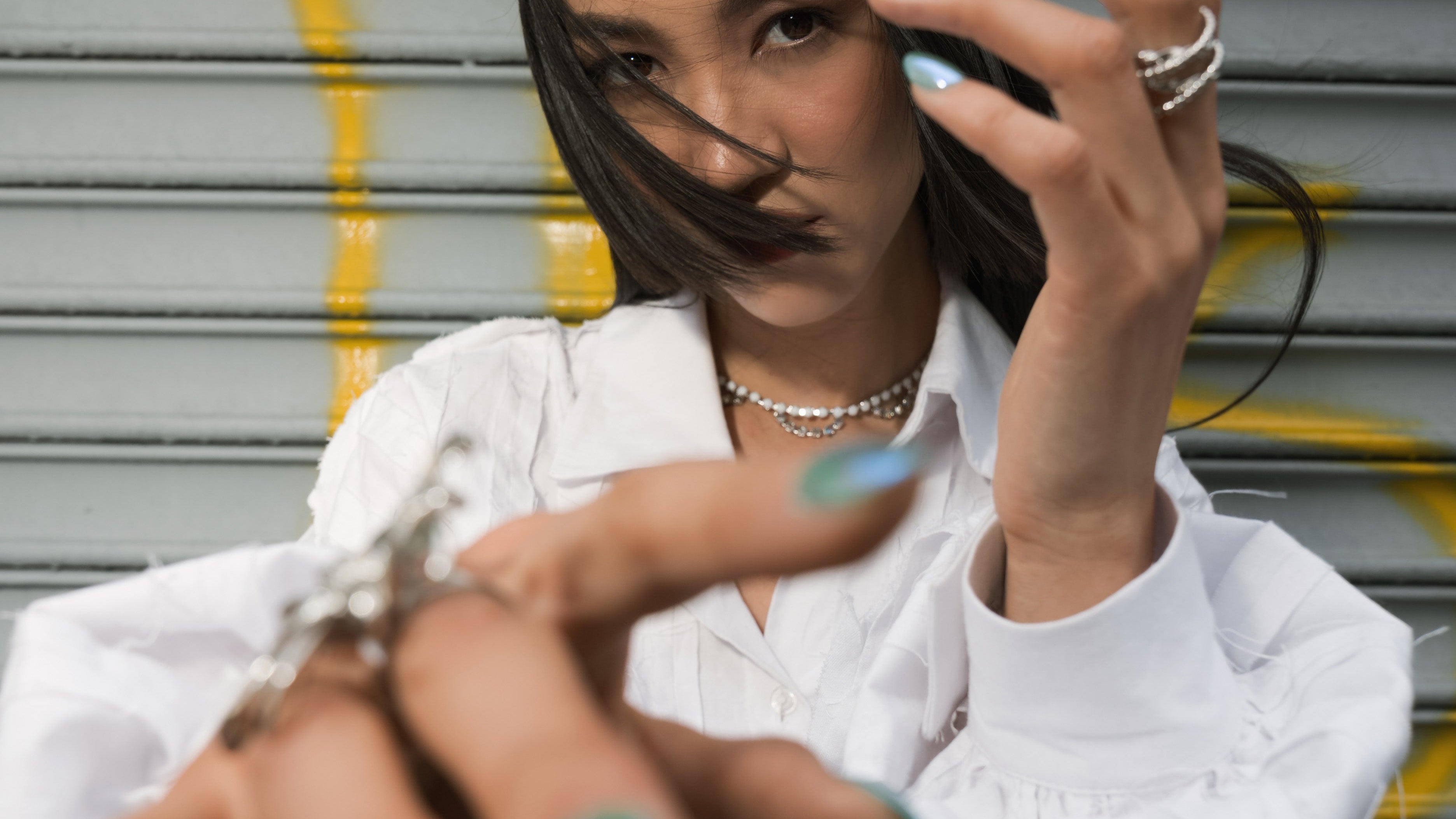
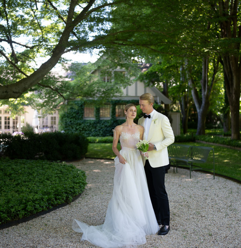
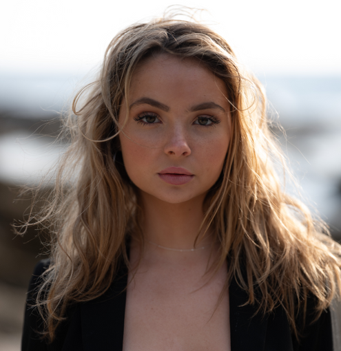
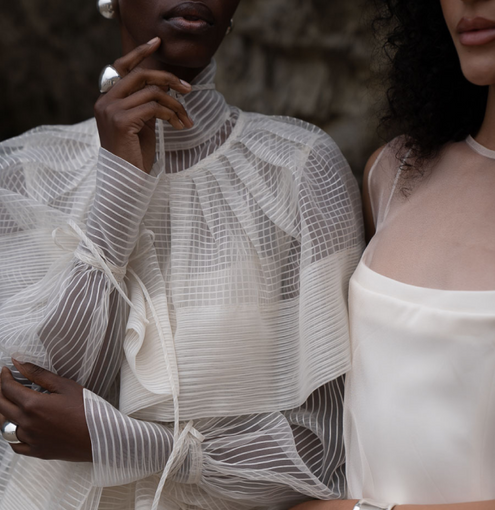
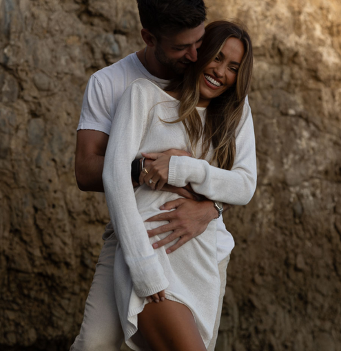
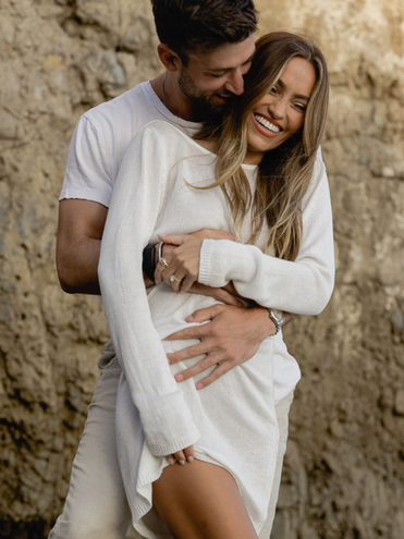
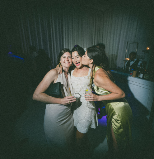
Where Couture is bold and sculpted, Prêt-à-Porter is the effortlessly polished backbone of any professional workflow—refined, adaptable, and meticulously balanced. Designed for photographers who need a go-to foundation that seamlessly transitions between lighting conditions and subject matter, these profiles deliver clean contrast, natural greens, and pristine skin tones without overcorrection or artificial hues.
Prêt-à-Porter is the natural starting point for any photographer investing in The Editorial Edit’s ecosystem. It is the everyday essential, providing a versatile base that elevates portraits, editorial work, and lifestyle imagery with ease. This collection is for those who want their work to feel intentional, timeless, and effortlessly high-end.
Yet, while it is designed for broad application, this collection is far from generic—its power lies in its adaptability. The Profile Intensity Slider allows for subtle adjustments or bold refinements, making it a favorite among professionals who demand control. With the right finesse, these profiles can create soft, romantic tones or lean into a sharp, editorial contrast, all while preserving the integrity of the original image.
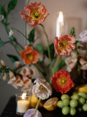
Many of these presets also serve as problem solvers, tackling common digital color issues like orange skin tones, dull highlights, and washed-out greens. Whether correcting exposure inconsistencies or fine-tuning color harmony, Prêt-à-Porter ensures that every frame looks intentional and beautifully finished.
What’s Included?
Prêt-à-Porter Profiles – The Foundation of Effortless Refinement
- Eight trans-dimensional profile-based presets designed to enhance, not overpower.
- Perfected for a seamless workflow across diverse lighting conditions.
- Balanced skin tones, clean contrast, and lush, natural greens that retain depth and authenticity.
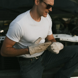
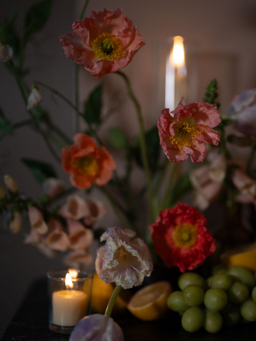
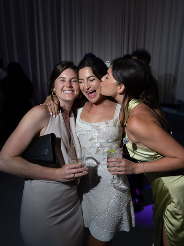
- Vintage Disposable – A nostalgic nod to the aesthetic of disposable film cameras, delivering rich contrast, softened highlights, and subtle grain for an effortless, documentary feel. Perfect for lifestyle and candid storytelling.
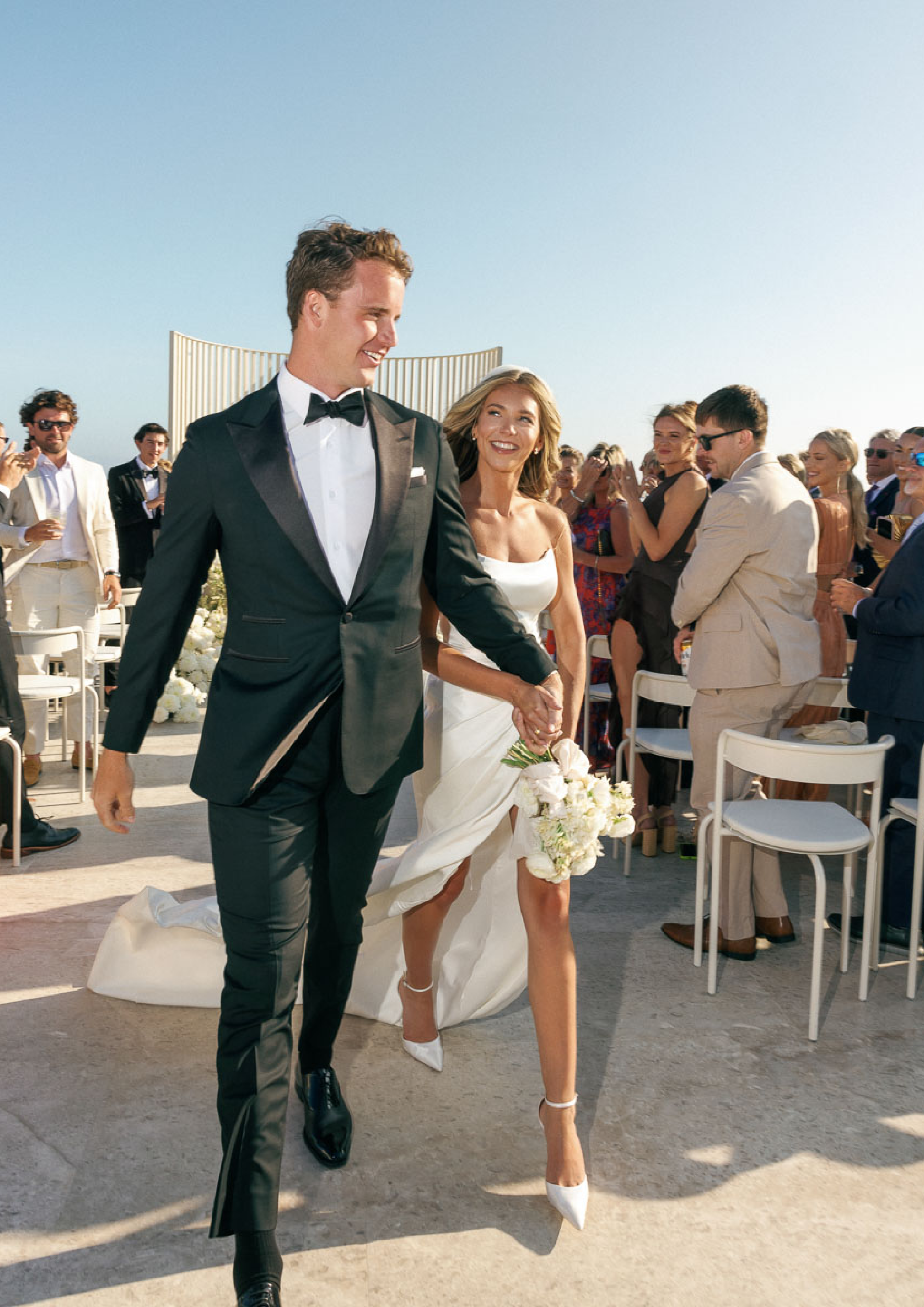
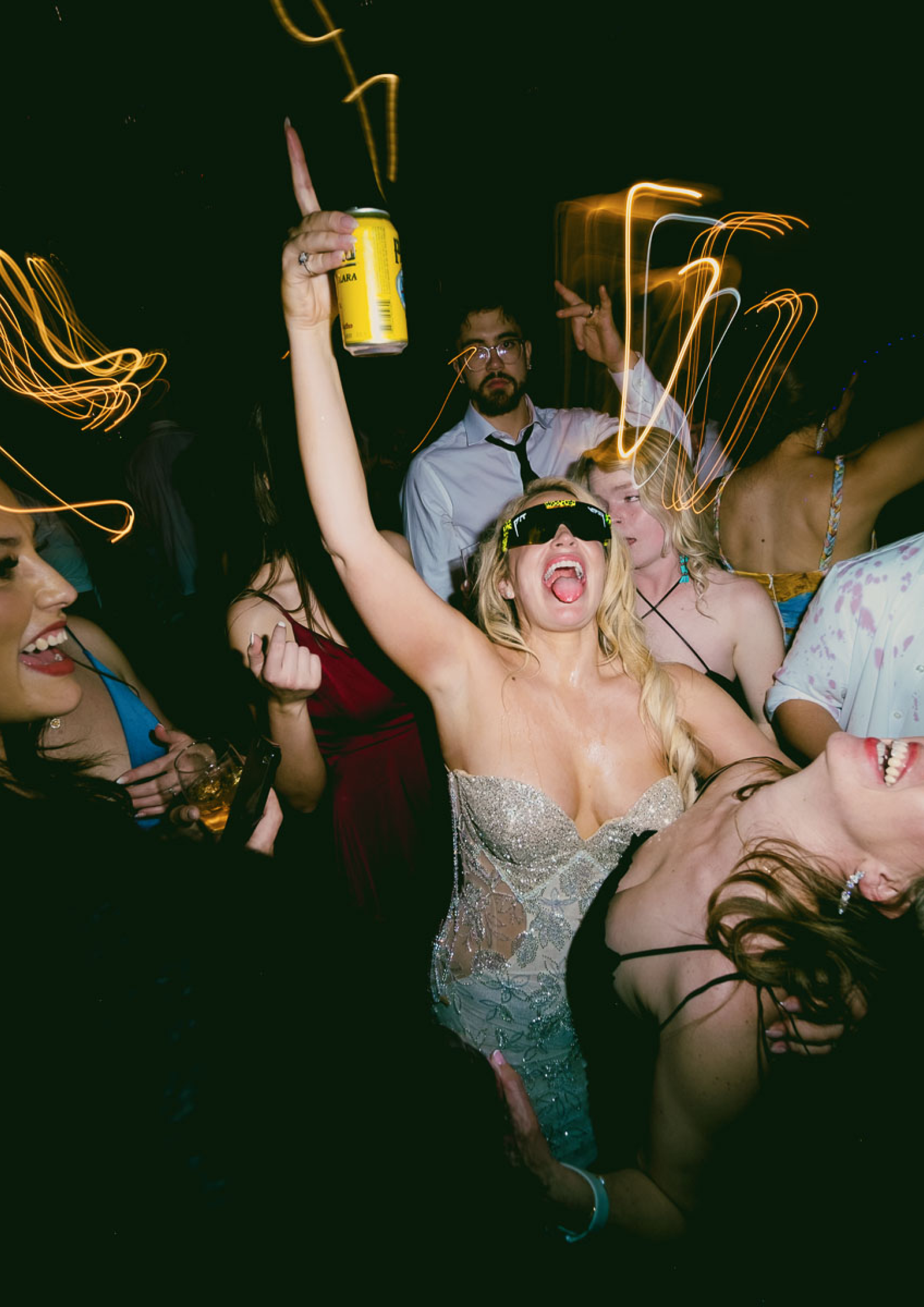
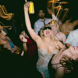
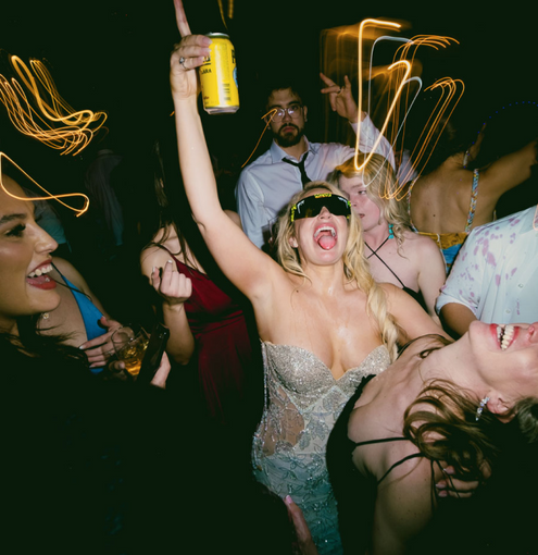
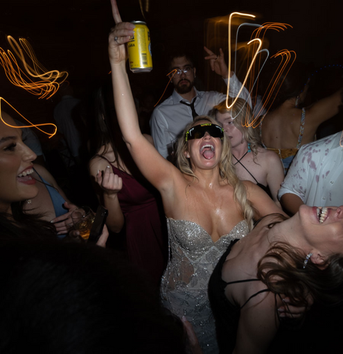
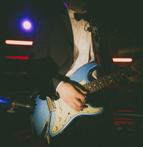
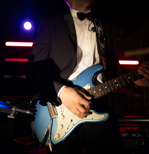
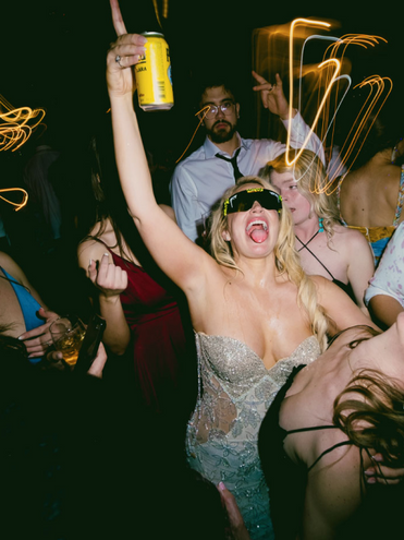
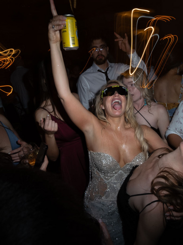
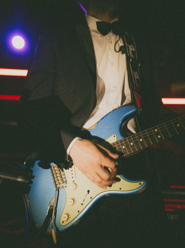
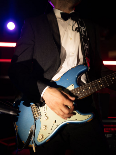
- Hollyweird – A direct flash preset built for bold, high-energy environments, ensuring punchy contrast, crisp whites, and deep blacks. Ideal for Dark, high energy dance-floors when your flash Is the dominate source of light, coupled with the fun unpredictability of a slower shutter and dynamic colored dance floor Illuminations.
- Fauxgla I & II – Inspired by the unpredictable charm of toy cameras, these presets introduce playful light leaks, organic tonal shifts, and subtle vignetting to add a distinctly experimental, analog-inspired character to your work.
CANON CR3 COMPATIBILITY + ENHANCEMENT PROFILES — BRINGING CANON COLOR BACK TO LIFE
- Developed exclusively for Canon mirrorless bodies (.CR3 format) to correct early gamut clipping and tonal compression.
- Built using a custom Canon color mesh that restores sensor nuance, dynamic range, and tonal separation lost in Adobe’s default interpretation.
- Designed to blend seamlessly at an 80% profile strength for natural integration with all tEE presets.
- Unlocks true-to-life skin tones, organic highlight roll-off, and smooth color transitions — no more waxy reds, muddy shadows, or radioactive greens.
- Engineered for consistency across Canon’s R-series lineup (R3, R5, R6, R6ii, R7, R8, R10, R50, RP, and EOS R).
- Fully compatible with all tEE packs and tools, delivering cohesive color across mixed camera systems.
- Eliminates unpredictable slider behavior in Temp, Tint, and Saturation, ensuring fine-tuned control and accurate preview response.
- Developed directly from real-world testing with Canon shooters to achieve near-identical tonal response to the Prêt-à-Porter and Couture Kodachrome base look.
TEE TOOLS Vol. 1 – Color & Intensity Enabled
For those who demand precision, these tools provide fine-tuned control over color accuracy, tonal balance, and depth. Whether it’s removing dullness, sculpting contrast, or adding cinematic grain, this suite ensures your images remain both refined and impactful.
- DE-DIN-GEE 1 & 2 – Restores a more natural white point by removing unwanted dullness and twisting specific color channels to bring a true-to-life sense of contrast back to an image—without clipping highlights.
- Warm Peak Highlight – Enhances warmth in highlights without compromising shadows.
- Cellulose 1, 2, & 3 – Adds refined grain while subtly shifting tonality for an authentic filmic feel.
- Underexposed Black Point 1, 2, & 3 – Deepens shadows for rich, dimensional contrast.
- Contrast OOMPH 1, 2, & 3 – A strategic contrast boost that avoids harsh clipping.
- Sharp, Smooth, Clean – A refined sharpening tool that enhances detail while maintaining elegance.
- Grain Gain 1, 2, & 3 – Subtle, film-like grain textures for depth and character.
TEE TOOLS Vol. 1 – AI Intensity Enabled
TEE TOOLS Vol. 1 – AI Intensity Enabled
A powerful AI-driven toolkit that works with ImagenAI and other AI-powered editing platforms to intelligently refine your edits. These tools adapt dynamically, making precision adjustments while maintaining natural detail and organic texture.
- Blue Sky Correct for De-Dingy 1, 2, & 3 – Restores depth and vibrance to skies without unnatural oversaturation.
- Darken Background – Enhances subject separation by subtly deepening background exposure.
- Editorial Skin Glow 1, 2, & 3 – Creates hydrated, luminous skin while keeping texture intact.
- Editorial Skin Luster 1, 2, & 3 – Enhances natural skin highlights for sculpted dimension.
- Editorial Skin Smooth 1, 2, & 3 – Evens out skin texture while preserving pores and fine details.
- Rosebud Lip Boost – A quick, natural enhancement that subtly enriches lip tone for a hydrated look.
This collection isn’t just an editing shortcut—it’s a complete workflow solution designed for photographers who demand effortless consistency, natural refinement, and complete control.
Own it today. Elevate your edit forever.
Complete the look:

About the preset designer
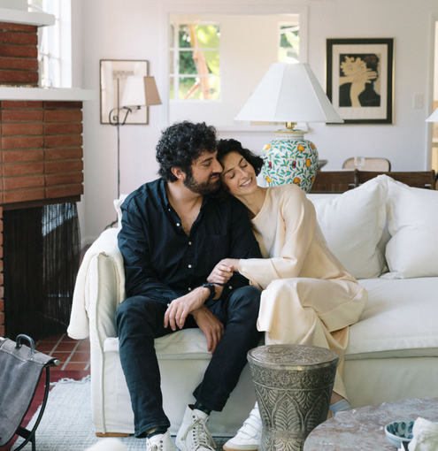
Paul Von Rieter is a Fujifilm global ambassador and a celebrated film and digital medium-format editorial photographer known for his refined color work, cinematic tonal accuracy, and unapologetic love of direct flash. His imagery has taken him around the world photographing remarkable people in remarkable places, and his approach to color science has quietly become a benchmark for photographers seeking a modern, editorial aesthetic.
All photographers know the same quiet frustration Paul once faced: the image in your mind looks editorial, polished, and cinematic… but the color coming out of Lightroom never fully matches that vision. As a film-born artist working in both film and digital medium format, Paul knew exactly how he wanted his work to feel—clean skin, natural greens, honest color, and that unmistakably elevated editorial finish. But no preset on the market delivered what he saw in his head.
He tried everything.
He even collaborated with several leading preset companies, hoping the right partnership could translate his aesthetic into reliable tools. The results always fell short. The technology simply couldn’t produce the depth, accuracy, or consistency he demanded from his own work.
So Paul took a different path—one grounded in curiosity, discipline, and a need to understand color at its core.
He stepped away from the existing preset landscape entirely and immersed himself in color science. For months he worked in near isolation, studying a thousand-page text, working on a perfectly calibrated display, and consulting with some of the world’s foremost color scientists. After more than 45,000 RAW test files—spanning nearly every major camera system—he uncovered something no preset brand had achieved.
To create truly editorial color, he had to build the palette outside Adobe’s ecosystem first.
Only after crafting those tones from scratch could he then engineer them back into Lightroom’s architecture, coaxing the software into rendering color more beautifully, faithfully, and intentionally than it was ever designed to.
That breakthrough became The Editorial Edit.
Every preset pack Paul releases is rooted in that same process—ground-up, film-inspired tools crafted for photographers who care about intention, precision, and modern editorial nuance. These aren’t generic filters or shortcuts. They are the exact tools Paul uses to create the work that defined his career.
Today, The Editorial Edit is used by thousands of photographers around the world who want their images to look deliberate, elevated, and memorable—matching the vision they see in their mind with the color they see on their screen.
Your work deserves to look as striking and intentional as it feels. The Editorial Edit exists to make that possible.
You can find Paul @Paulvonrieter on most social media platforms.

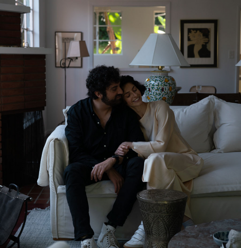
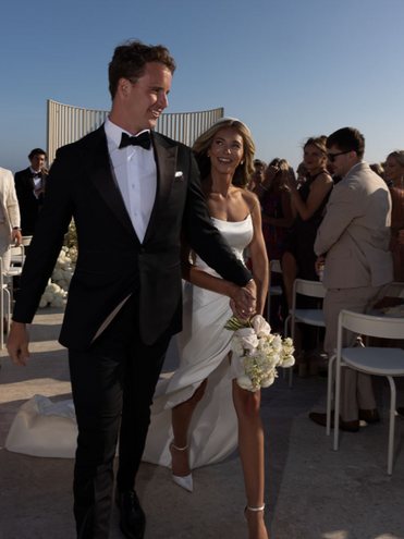
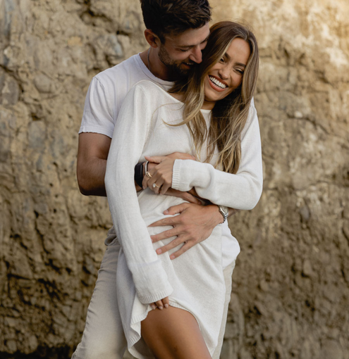
Paul Von Rieter with his Fiancé Taylor, Photographed by Joel Serrato
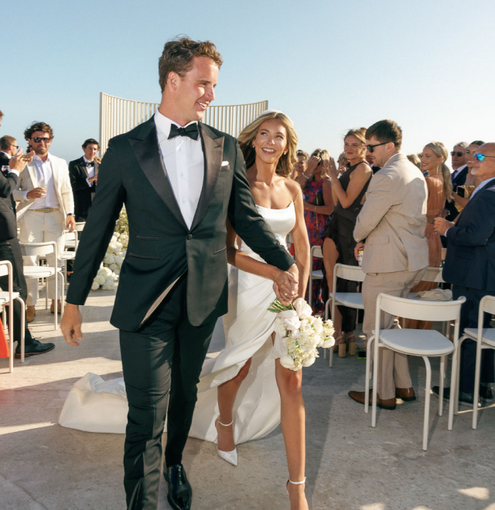
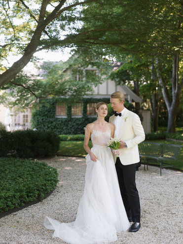
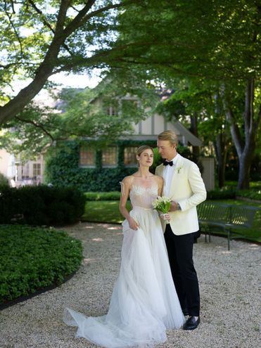
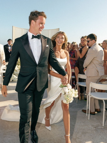
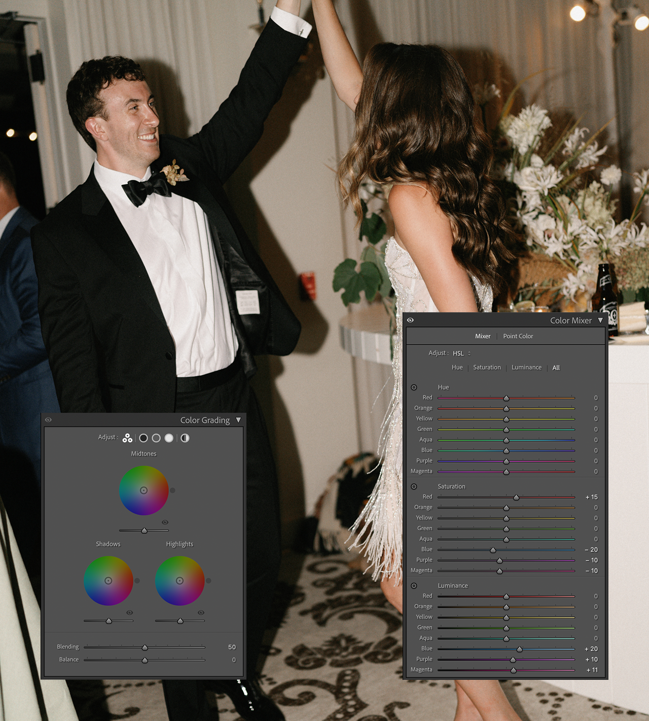
COUTURE PACK PROFILES
BEFORE & AFTER
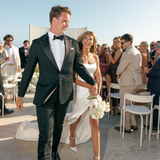
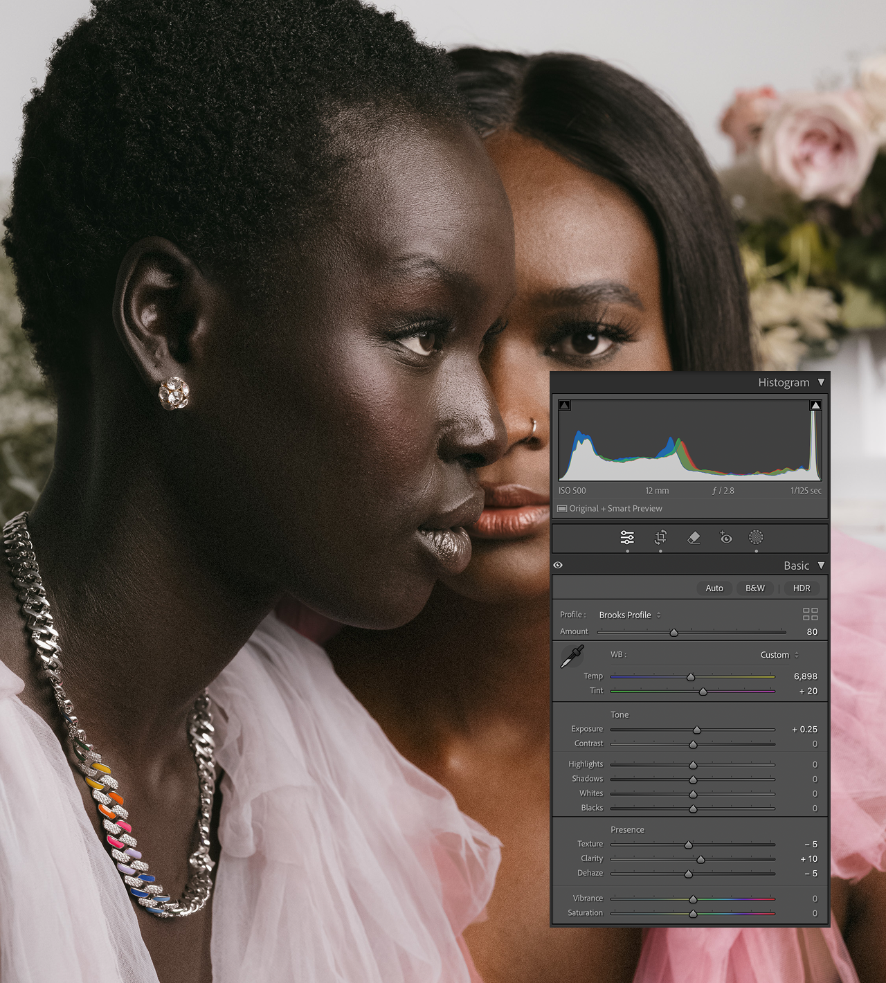
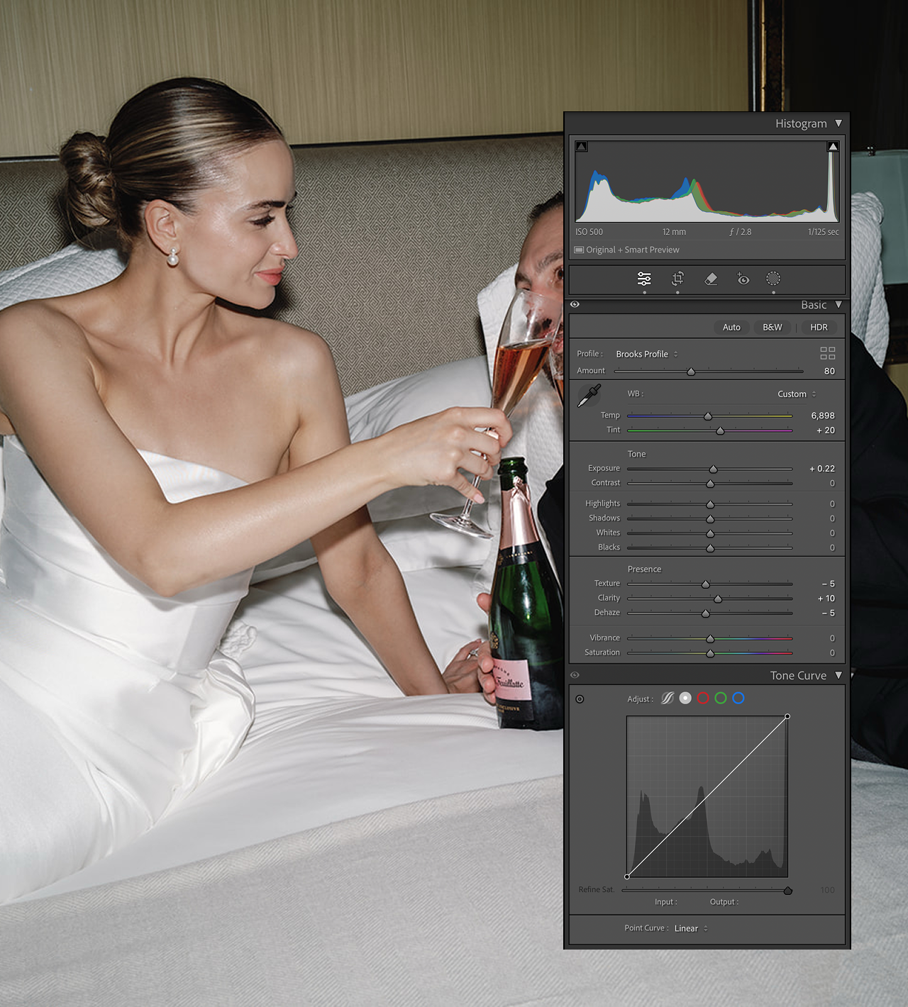
BROOKS - SUGGESTED USE
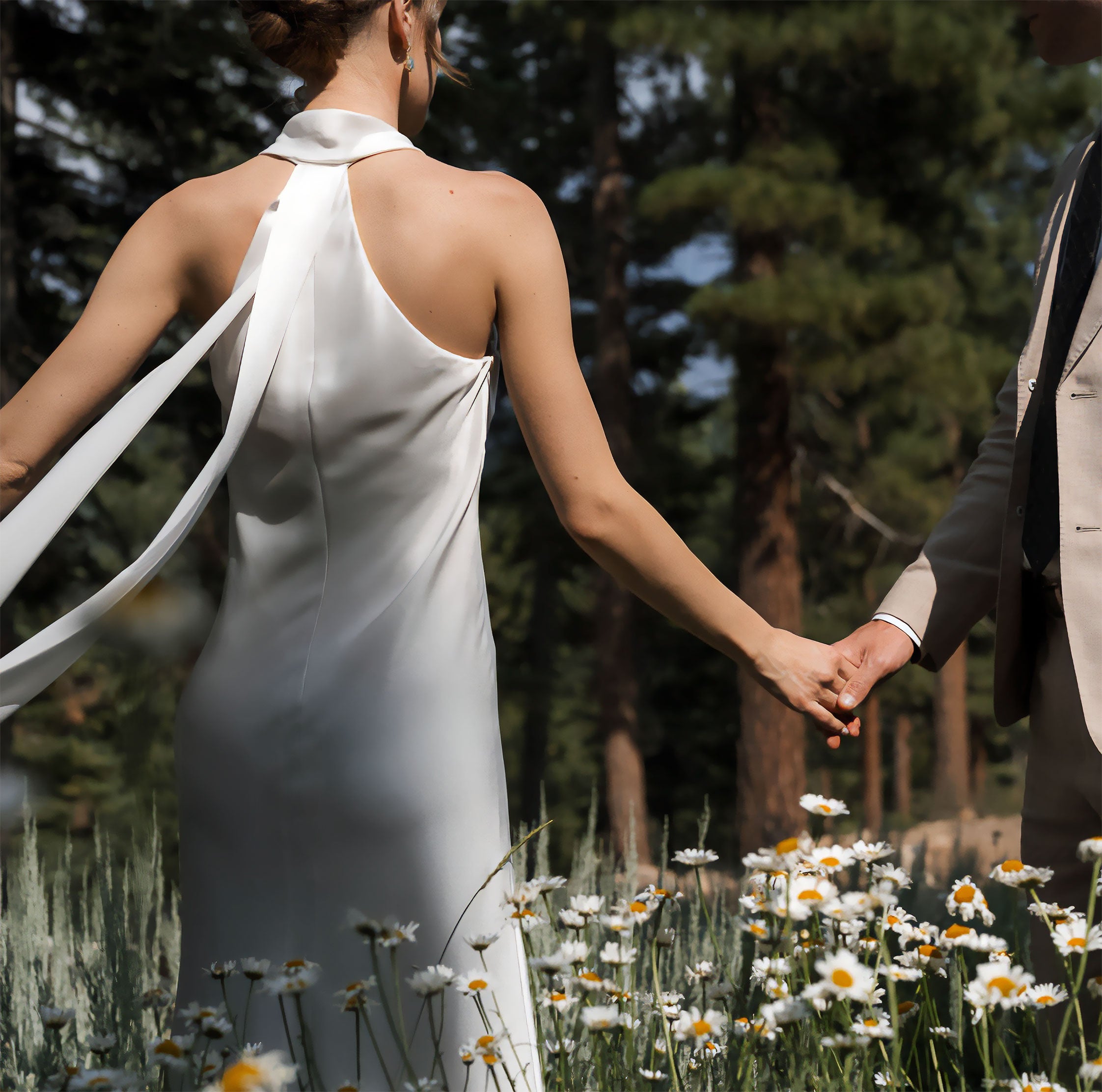
Ideal for outdoor portraits with natural light, enhancing warm tones while maintaining soft contrast and a deep and consistent black point. Perfect for romantic, candid moments.
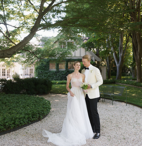
Thalia - SUGGESTED USE
Equally at home being used for fashion or editorial portraits, bringing a slight matte finish and deepening shadows for a high-contrast, polished look. Greens will shift toward deep emerald.
Manzanita - SUGGESTED USE
Shines in the harshest of back light with a powerful and resilient black point. Enhances greens and earth tones, perfect for nature-filled shots while being just as at home in a light filled living room. A power packed preset that loves the intensity slider.
BROOKS - SUGGESTED USE
Ideal for outdoor portraits with natural light, enhancing warm tones while maintaining soft contrast and a deep and consistent black point. Perfect for romantic, candid moments.
Thalia - SUGGESTED USE
Equally at home being used for fashion or editorial portraits, bringing a slight matte finish and deepening shadows for a high-contrast, polished look. Greens will shift toward deep emerald.
Manzanita - SUGGESTED USE
Shines in the harshest of back light with a powerful and resilient black point. Enhances greens and earth tones, perfect for nature-filled shots while being just as at home in a light filled living room. A power packed preset that loves the intensity slider.
Bluebird - SUGGESTED US
Excellent for blue hour or low-light conditions, this preset brings out cool tones and elevates depth without losing detail. Greens lean blue, with a mid-tone lift and a cool shift to the shadows.
Birdrock - SUGGESTED USE
If you hate orange skin-tones, then this preset will be your new best friend. It is contrasty with out being crunchy. It's light touch without being absent of depth. Put it on everything. Spread it on toast. Consume. Repeat. (this is PVR's fav.)
Pearl - SUGGESTED USE
Soft and dreamy, designed for delicate portraits, adding a gentle glow and reducing harsh contrasts for a refined look. The most powerful preset in the collection. She does things with dynamic range that shouldn't be possible.
Cress - SUGGESTED USE
Cress leans warm with medium contrast. In some lighting conditions you may spot bit of a very subtle green tint in the shadows, reminiscent of slightly under exposed kodak Perfect for that beach engagement session.
Fern - SUGGESTED USE
Designed for lush, green environments, Fern balances light and shadow to bring out the richness in foliage while maintaining natural tones and a strong contrast curve. Clean, bright and vivid, while still preserving skin-tone.
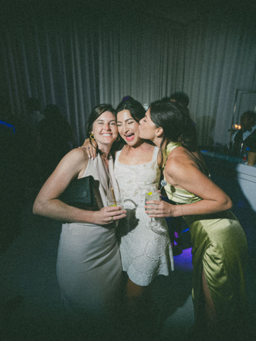
Vintage Disposable - SUGGESTED USE
Ideal for creating a nostalgic, film-like look with subtle grain and a soft color palette, perfect for casual, lifestyle shots with direct flash. Rich contrast without being too in your face about it, with a warm under tone.
Cress - SUGGESTED USE
Cress leans warm with medium contrast. In some lighting conditions you may spot bit of a very subtle green tint in the shadows, reminiscent of slightly under exposed kodak Perfect for that beach engagement session.
Fern - SUGGESTED USE
Designed for lush, green environments, Fern balances light and shadow to bring out the richness in foliage while maintaining natural tones and a strong contrast curve. Clean, bright and vivid, while still preserving skin-tone.
Vintage Disposable - SUGGESTED USE
Ideal for creating a nostalgic, film-like look with subtle grain and a soft color palette, perfect for casual, lifestyle shots with direct flash. Rich contrast without being too in your face about it, with a warm under tone.
Hollyweird - SUGGESTED USe
Built specifically to utilize with Direct flash on the dance floor or environments where flash is dominating 90% of ambient light. Hollyweird is made to get the most out of LED's, glowsticks, DJ dance lighting, etc.
Fauxgla I - SUGGESTED USE
A playful, flash-heavy preset that mimics the aesthetic of disposable cameras, perfect for party or event photography with a fun twist. Utilize both the preset and profile intensity slider to dial in your ideal look.
fauxgla II - SUGGESTED USE
Similar to Fauxgla 1 but with a softer, slightly warmer tone, making it ideal for capturing intimate moments in lively settings.Utilize both the preset and profile intensity slider to dial in your ideal look.
"THESE PRESETS ARE LIKE MAGIC!"
"My go-to editing companion. They have transformed the way I approach photo editing. They read my mind on the exact tones I'm envisioning for my images. They are clean yet still visually interesting. With The Editorial Edit, you will get true-to-life colors that remain timeless."
- LAURA MURRAY
TECHNOLOGY
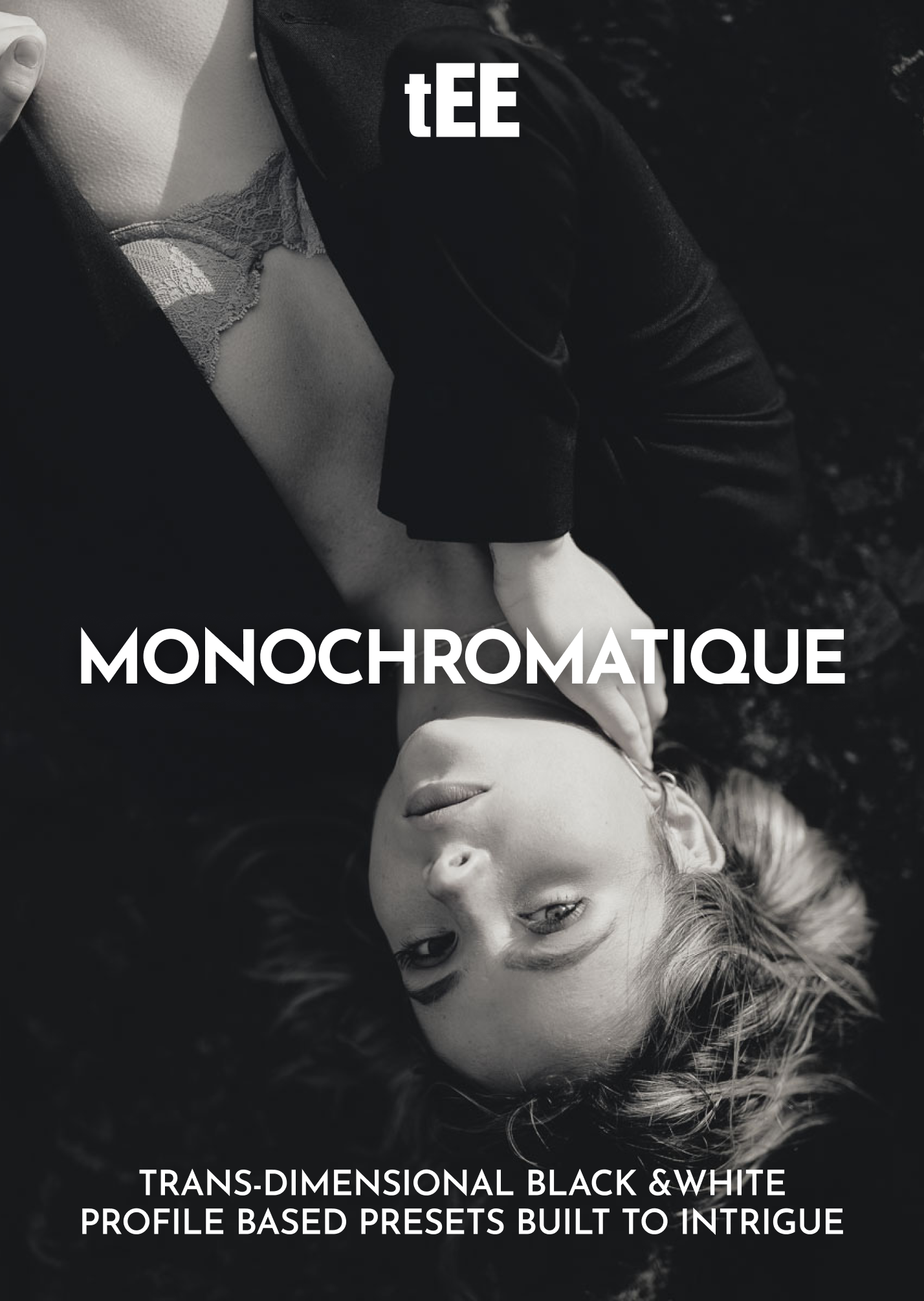
Trans-Dimensional Profile System
Harnessing proprietary color science and AI innovation, our profiles adapt to any lighting scenario, ensuring true-to-life colors and impeccable skin tones every time.
TECHNOLOGY
Seamless Workflow Integration
Engineered to integrate effortlessly with Lightroom, these advanced profiles transform complex color adjustments into intuitive, one-click edits—without disrupting your creative process.
TECHNOLOGY
Constant Evolution
We refine and enhance our legacy offerings while pioneering new solutions, so your editing tools stay powerful, relevant, and ready for the future.
FRIENDLY NOTE
Terms of sale
Our products are digital, which means all sales are final—we can’t offer refunds, exchanges, or cancellations. But we get it—too many presets promise the world and leave you disappointed. Ours don’t. If you want proof before you commit, click ‘Try’ in the menu to see them in action—no surprises, no regrets. By completing your purchase, you acknowledge and agree to these terms.